Echo Theatre Company
Let’s be real — community theaters don’t always have the most engaging design. How do you make a community theater look professional to its audience?
-
Community theater, but make it Broadway! The shows that this theatre puts on are high quality, and so should all materials/platforms that represent it.
-
Concept, branding, design, photography
-
Illustrator, Photoshop, Nikon D3100
Logo
The diagonal element within the logo is meant to represent the fourth wall, the imaginary boundary between the actors and audience. Real theatre distorts that line, however, and requires a give and take between the audience and performers.
Posters
These posters are simple and impactful. When hung up in series, the type continues from poster to poster and as such they act as a larger piece. As the company is well known within its community, minimal information is included on the poster itself.
Tickets
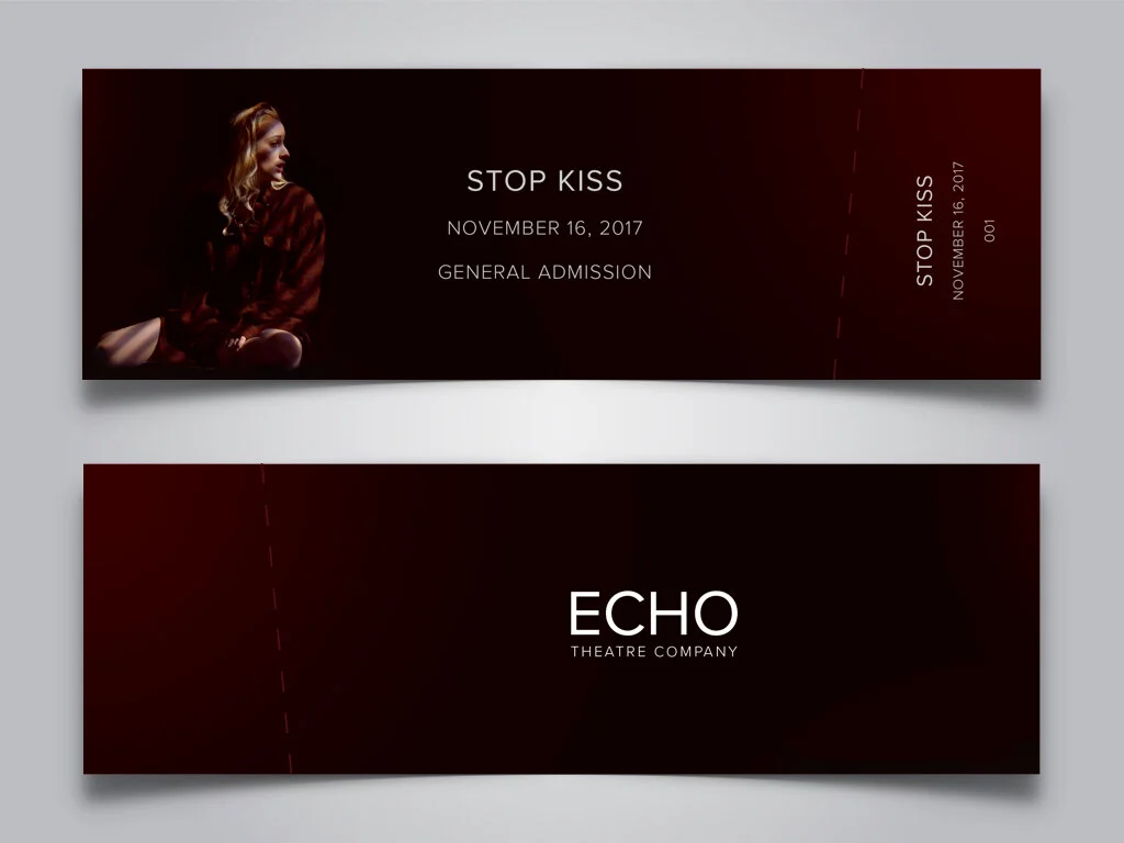
The tickets can be kept as collectible items as they feature photography from the show.
Snapchat filters
Snapchat geofilters are a great way to advertise to the community. Echo aims to attract younger generations to the intrigues of theatre. Geofilters offer the ability to emphasize the community aspect of the Princeton theatre scene with this fun and interactive medium.
Mobile website
The mobile website allows users to look through the current season, learn about the upcoming shows, purchase tickets, and keep themselves up to date on other events such as auditions and workshops.
Identity
The diagonal is carried through all elements of the branding, as seen in the stationary here.
Other projects


